The question
How can a single form carry an identity without leaning on a logo?
A little tension. A lot of possibility.
Illustrative project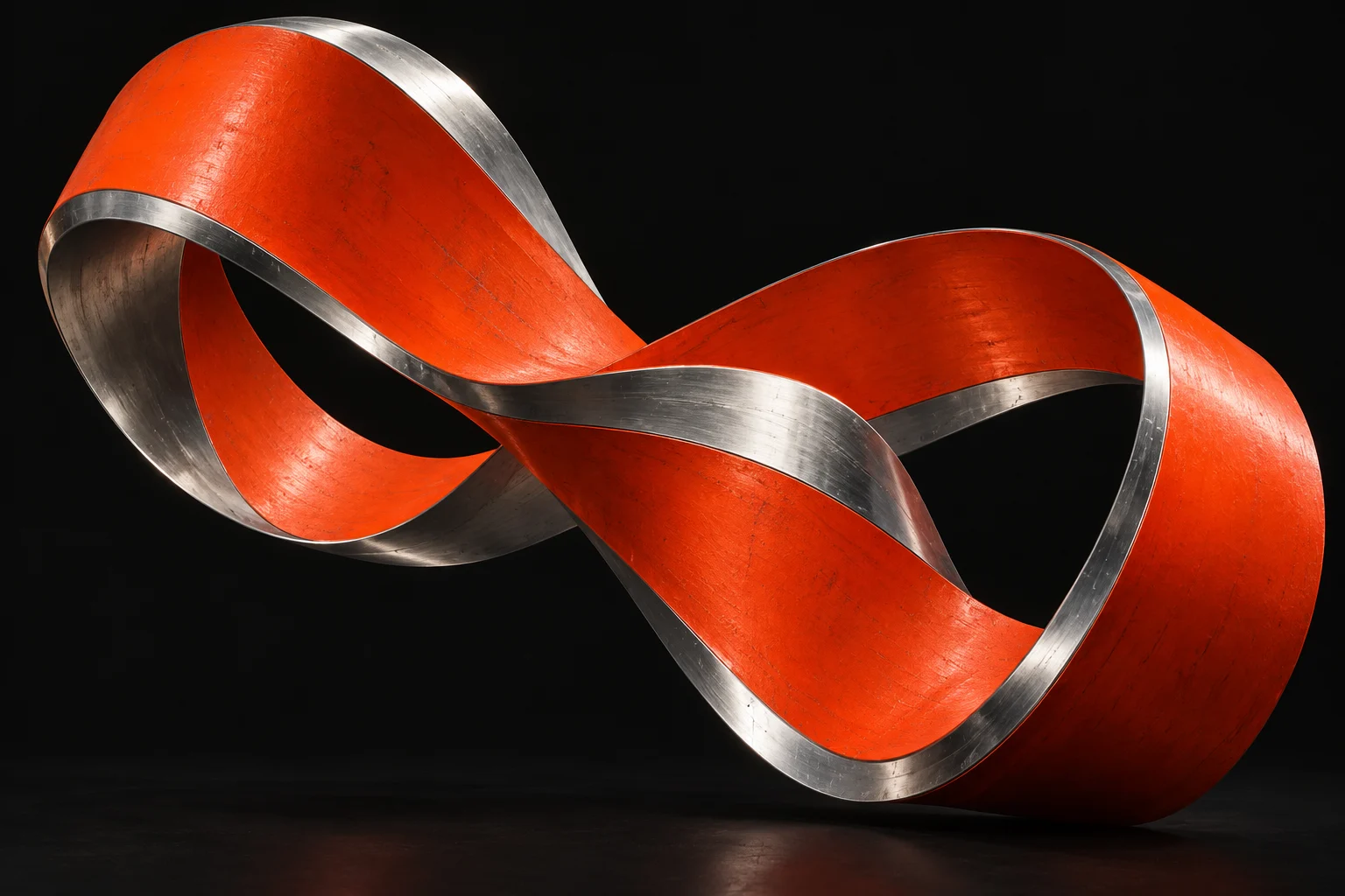
An experiment in making a digital identity feel physical. One continuous ribbon becomes the starting point for a flexible visual language.
How can a single form carry an identity without leaning on a logo?
Start with tension: a hard material behaving like a soft ribbon. Pair close crops with a strict grid, then let scale and movement do the storytelling.
An independent visual study. The artwork is AI generated; this is not a commissioned client project.
These are three browser-built graphic applications of the same artwork: a portrait announcement, a wide editorial masthead and a compact index card. They test the idea at different scales; they are not client commissions or finished identity deliverables.
 Material / movement / possibilityA lot of possibility / 02FORM IN
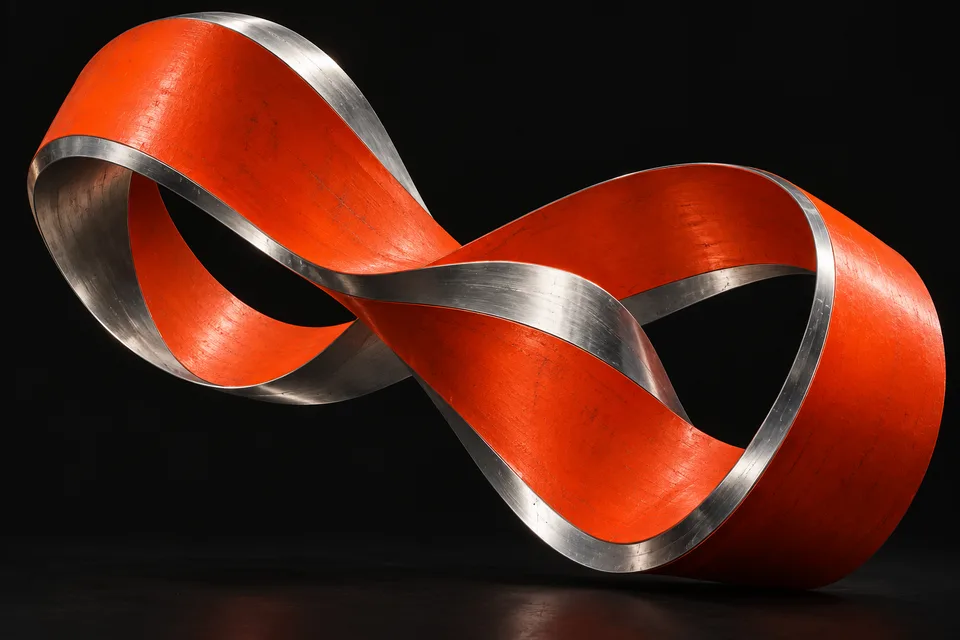
The source is one AI-generated ribbon image. These studies use crops, scale and type rather than implying new photography, a client identity or a completed campaign. Essential text stays outside the image.
The portrait crop emphasizes surface and tension; the wide view shows the loop; the index reduces it to a recognizable accent. Warm paper and vermilion connect the applications without requiring a new logo.
Browser checks at 320px, 390px and desktop widths kept all three applications within the viewport. Separating type from the artwork preserved the full headline at each size; the wide masthead needed its own divided layout rather than a cropped portrait. These are rendering checks, not audience research or evidence of business results.
MAKE
ROOM FOR
THE IDEA.